

Plugin Development
The following steps walk you through the development of a Hello World plugin that adds a simple message to the annotation editor.
Prerequisites
Section titled “Prerequisites”Before starting, make sure you have the following installed:
- NodeJS (version 22+ recommended)
- npm
Create Your Project
Section titled “Create Your Project”Step 1: Choose from GitHub Template or Manual Setup
Section titled “Step 1: Choose from GitHub Template or Manual Setup”There is a GitHub template that you can use to quickly bootstrap your new project. However if you prefer you can build your project from scratch.
Step 1.1.1: Create New Project From Template
Section titled “Step 1.1.1: Create New Project From Template”- In your browser, go to the template repository
- Above the file list, click Use this template.
- Select Create a new repository.

- Use the Owner dropdown menu to select the account you want to own the repository.
- Type a name for your repository, and an optional description.

-
Choose a repository visibility.
-
Click
Create repository.
Step 1.1.2: Clone Repository to Your Local Workspace
Section titled “Step 1.1.2: Clone Repository to Your Local Workspace”In a terminal window clone the repository that you just created:
git clone https://github.com/[Your Repository].gitChange your directory to the cloned repository and run:
npm installOpen your package.json file and name your plugin. It should match the name you created above (i.e. @performant/plugin-hello-world).
{ "name": "@recogito/plugin-template", "name": "@performant/plugin-hello-world" "version": "0.1.0", "description": "A template to boot-strap a new Recogito Studio plugin project.", "description": "My new Recogito Studio Plugin" ...}You can now proceed to Step 2. You will find that some of the proceeding steps have been taken care of by the template.
Step 1.2.1: Initialize a New Plugin Project
Section titled “Step 1.2.1: Initialize a New Plugin Project”Create a new directory for your plugin and initialize an npm project:
mkdir plugin-hello-worldcd plugin-hello-worldnpm initInstall the following dev dependencies:
npm install --save-dev @types/node @types/react @types/react-dom typescript copyfilesnpm install --save-dev astro react react-domThen, install the Recogito Studio SDK as runtime dependencies:
npm install @recogito/studio-sdkStep 1.2.2: Configure TypeScript
Section titled “Step 1.2.2: Configure TypeScript”Create a tsconfig.json file in your project root:
{ "compilerOptions": { "allowJs": true, "allowSyntheticDefaultImports": true, "baseUrl": ".", "declaration": true, "declarationMap": true, "isolatedModules": true, "jsx": "react-jsx", "lib": ["ESNext", "DOM", "DOM.Iterable"], "module": "ESNext", "moduleResolution": "bundler", "outDir": "dist", "resolveJsonModule": true, "skipLibCheck": true, "strict": true, "target": "ESNext" }, "include": ["src", "test"], "exclude": ["node_modules", "dist"]}Make sure the following lines are in your package.json:
{ // ... "type": "module", "files": ["dist"], "scripts": { "build": "tsc && npm run copy-files", "copy-files": "copyfiles -u 1 \"src/extensions/**/*.css\" \"src/extensions/**/*.jpg\" \"src/extensions/**/*.png\" dist" }}Step 2: Create the Plugin Entry Point
Section titled “Step 2: Create the Plugin Entry Point”The entry point is a TypeScript file (src/index.ts) that exports an Astro Integration and registers a Plugin. Here’s a sample implementation:
import type { AstroIntegration } from "astro";import { Plugin, registerPlugin } from "@recogito/studio-sdk";
const HelloWorldPlugin: Plugin = {  name: "My Hello World Plugin",  module_name: '@performant/plugin-hello-world',  description: "An example Hello World plugin.",  author: "Performant Software",  homepage: "https://www.performantsoftware.com/",};
const plugin = (): AstroIntegration => ({  name: "plugin-hello-world",  hooks: {    "astro:config:setup": ({ config, logger }) => {      registerPlugin(HelloWorldPlugin, config, logger);    },  },});
export default plugin;
Step 3: Install the Test Application Template
Section titled “Step 3: Install the Test Application Template”Run the following command to set up the test application:
npx copy-templateAdd a development script to your package.json. (Note that this may already be there if you cloned the template repository.)
{ "scripts": { "dev": "npm start --prefix .dev/" }}Step 4: Configure the Test Application
Section titled “Step 4: Configure the Test Application”Update .dev/package.json to include your plugin:
{ "dependencies": { "@performant/plugin-hello-world": "file:../" }}Modify .dev/astro.config.mjs:
import { defineConfig } from 'astro/config';import react from '@astrojs/react';import node from '@astrojs/node';import HelloWorldPlugin from '@performant/plugin-hello-world';
export default defineConfig({  integrations: [    react(),    HelloWorldPlugin()  ],  // ... other configurations});
Update the test application’s dependencies:
cd .devnpm installStep 5: Create a UI Extension
Section titled “Step 5: Create a UI Extension”Create a React component in src/extensions/HelloWorldMessage.tsx:
export const HelloWorldMessage = () => { return <div>Hello World</div>;};Update the index.ts file to register the component as a UI extension:
import type { AstroIntegration } from 'astro';import { Plugin, registerPlugin } from '@recogito/studio-sdk';
const HelloWorldPlugin: Plugin = {  name: 'My Hello World Plugin',  module_name: '@performant/plugin-hello-world',  description: 'An example Hello World plugin.',  author: 'Performant Software',  homepage: 'https://www.performantsoftware.com/',
  extensions: [{    name: 'hello-world-message',    component_name: 'HelloWorldMessage',    extension_point: 'annotation:*:annotation-editor'  }]};
const plugin = (): AstroIntegration  => ({  name: 'plugin-hello-world',  hooks: {    'astro:config:setup': ({ config, logger }) => {      registerPlugin(HelloWorldPlugin, config, logger);    }  }});
export default plugin;
In the package.json, add an export for the UI extension:
{ "exports": { ".": "./dist/index.js", "./HelloWorldMessage": "./dist/extensions/HelloWorldMessage.js" }}Test Your Extension
Section titled “Test Your Extension”- Build the plugin package:
npm run build- Run the development process in your project root folder:
npm installnpm run dev- Open browser to
http://localhost:4321/
Testing Against the Client Application
Section titled “Testing Against the Client Application”The .dev/ harness mounts your extension in isolation, which is ideal for iterating on the component itself. But it renders the extension in a bare container—it does not reproduce the surrounding Recogito Studio UI. Behavior that depends on that context (e.g. layout inside the annotation editor, styles inherited from the client) will only show up in the real client. For those cases, test your unpublished, local plugin against a full recogito-client checkout:
-
Build the plugin. The client imports the compiled
dist/, not your source, so build first (and rebuild after every change):Terminal window npm run build -
Add the checkout as a local
file:dependency so the client resolves it by package name. In the client’spackage.json, point the dependency at your plugin directory, thennpm install:"dependencies": {// ..."@performant/plugin-hello-world": "file:../plugin-hello-world"} -
Register it. List the package name in
INSTALLED_PLUGINSin the client’s.env, then restart the dev server:Terminal window INSTALLED_PLUGINS="@performant/plugin-hello-world" -
Run the client and enable the plugin per project from Project Settings → Plugins.
When you’re done, revert the temporary changes: remove the file: dependency from the client’s package.json (run npm install again), and drop the package from INSTALLED_PLUGINS.
Extension Points
Section titled “Extension Points”An extension’s extension_point decides where its component mounts. The available points are:
admin— the instance admin settings areaproject:document-actions— the document card actions menuannotation:<view>:annotation-editor— inside the annotation editorannotation:<view>:annotator— alongside the annotator instanceannotation:<view>:toolbar— the annotation view toolbarannotation:<view>:taglist— the annotation tag list
<view> is image, text, or * (any view), and each segment accepts * as a wildcard — so annotation:*:annotation-editor targets the editor in every annotation view.
Components receive typed props from the SDK based on their extension point. All extend ExtensionComponentProps (which provides the plugin, extension, and any per-project settings), with richer interfaces for specific points — for example, AnnotationEditorExtensionProps adds the current annotation and an onUpdateAnnotation callback, and DocumentCardActionsExtensionProps adds the document, context, and a closeDialog callback.
Installing Your Plugin
Section titled “Installing Your Plugin”Once your plugin is publishable (to the npm registry, or installable from a Git URL), it’s added to a Recogito Studio instance by listing its package name in the INSTALLED_PLUGINS environment variable and rebuilding the client. A Project Admin then enables it per project from Project Settings → Plugins.
See the Plugins guide for the full install-and-enable flow.
Component Styling
Section titled “Component Styling”The Recogito Studio Client utilizes Radix UI primitives for building accessible and consistent interface components. We recommend that plugin developers also adopt Radix when developing extension components.
To make it easier to build visually consistent extensions that match Recogito Studio’s native look and feel, the SDK provides a set of pre-defined CSS classes for common UI primitives. The following primitives and classes are currently available:
- Accordion. Base styles for the Radix Accordion primitive.
- Avatar. The Recogito-themed user avatar.
- Button. A range of button variant styles (primary, minimal, unstyled, danger, etc.)
- Checkbox. Base styles for the Radix checkbox primitive.
- Dialog. Default Radix popup dialog styles.
- Dropdown. Base styles for Recogito-themed dropdown menus.
- Form. Minimal styles for form input elements.
- Popover. Base styles for the Radix popover primitive.
- Radio. Base styles for the Radix Radio primitive.
- Select. Base styles for the Radix Select primitive.
- Switch. Base styles for the Radix Switch primitive.
- Tooltip. Styles for Recogito-themed mouse hover tooltips.
To apply SDK-provided theming, all that’s needed is to add the appropriate CSS classes to your components. For example:
// Use Radix Accordion in your extension componentimport * as Accordion from '@radix-ui/react-accordion';
// ...
<Accordion.Root  // Apply Recogito-provided `accordion-root` class  className="accordion-root"  type="multiple">  <Accordion.AccordionItem    value="item-1"    // Recogito-provided `accordion-item` class    className="accordion-item">    <Accordion.Header      // Recogito-provided `accordion-header` class      className="accordion-header">      <Accordion.Trigger        // Recogito-provided `accordion-trigger` class        className="accordion-trigger">        Accordion Item 1 Trigger      </Accordion.Trigger>    </Accordion.Header>
    <Accordion.AccordionContent      // Recogito-provided `accordion-content` class      className="accordion-content">      Accordion Item 1 Content    </Accordion.AccordionContent>  </Accordion.AccordionItem></Accordion.Root>
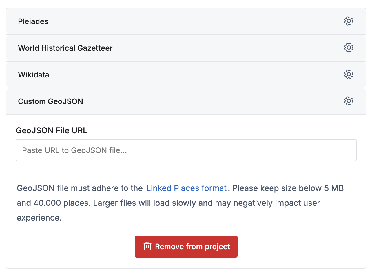
Styled example:
For details, classes and other components, check the stylesheet files directly.
Available Plugins
Section titled “Available Plugins”Here are the existing plugins available for Recogito Studio:
- GeoTagger – Tag annotations with geographical references from a gazetteer.
- Reconciliation Service API – Use a Reconciliation Service API endpoint as a tag source in your projects.
- NER Plugin – Automatically perform Named Entity Recognition on plain text and TEI documents.
- Revisions Plugin – Basic annotation revision functionality.
- TEI Inliner Plugin – Export TEI annotations as inline markup.
- Sandcastle3D Export – Custom annotation export for the Sandcastle project.